Website Design for Landscapers
Premium Green-Industry Lead Partner
premium website that turns traffic into booked calls.
Built for clarity, conversion, and local search so your site supports growth instead of sitting pretty
Local search domination focus
Conversion-first web + SEO
Partnership model, not fluff
01
Websites that look good but aren't built for SEO
Nice design, but no real site hierarchy, weak service structure, and nothing that helps Google understand what you do or where you work.
02
Google Business Profiles with reviews but no visibility
Plenty of reviews, yet the profile barely shows up because the foundation was never set correctly.
03
Content that gets traffic but no calls
Blog posts and pages targeting cities you don't serve or keywords that will never convert into real jobs.
04
Thousands spent on "cheap SEO" that does nothing
Monthly deliverables with no prioritization, no strategy, and no measurable impact.
05
Agencies that feel like a black box
You're paying every month, but you don't know what's being done, why it matters, or how it ties back to growth.
We see this constantly
You're investing—but
not winning.
Built for serious landscaping operators who want one partner to run the system—visibility, trust, and conversion—without chasing gimmicks
Most of the time, SEO isn't broken.
It's just being done in the wrong order by people who don't understand your business or your market.
We See This All the Time

Most operators don’t actually need a redesign; they need a site that’s built around how homeowners decide.
A “redesign” usually means fonts, colors, and layout. That can make the site look better, but it doesn’t fix the real problem: the site isn’t structured to match buying intent. Homeowners aren’t browsing landscaping websites for fun. They’re trying to answer fast questions: Do you do the service I need? Do you serve my area? Are you legitimate? How much is this going to cost? Can I trust you? And can I reach you right now?
If your pages don’t answer those questions in the right order. With clear offers, proof, and an obvious next step. You can drive more traffic and still get the same result: no leads. That’s why we focus on structure, messaging, and conversion paths first. Design supports that, it’s not the foundation.
Why most websites
don’t produce calls.
Here's what we see time and time again:
Websites that look good but aren’t built to convert
No clear offer, no proof near the CTA, and no reason to call you over the next guy.
Service pages that don’t match what people search
Either too thin, too generic, or missing the services that actually drive revenue.
No local SEO structure
Weak hierarchy, weak internal linking, and no foundation to support service-area pages later.
Slow, cluttered, or confusing mobile UX
If it’s hard to tap-to-call, you’re losing the highest-intent traffic.
“Set it and forget it” builds
The site launches, then decays, no updates, no maintenance, no iteration.
Websites that look good but aren't built for SEO
Nice design, but no real site hierarchy, weak service structure, and nothing that helps Google understand what you do or where you work.
Google Business Profiles with reviews but no visibility
Plenty of reviews, yet the profile barely shows up because the foundation was never set correctly.
Content that gets traffic but no calls
Blog posts and pages targeting cities you don't serve or keywords that will never convert into real jobs.
Thousands spent on "cheap SEO" that does nothing
Monthly deliverables with no prioritization, no strategy, and no measurable impact.
Thousands spent on "cheap SEO" that does nothing
Monthly deliverables with no prioritization, no strategy, and no measurable impact.
A website can look premium and still be a silent killer if the structure and conversion flow are wrong.
What you get
Conversion-first structure,
built for local search
We build for clarity and action: the right pages, the right hierarchy, and the right
conversion paths so traffic turns into calls
What It Includes:
Clear Service Pages
Strong Call-To-Actions (CTAs)
Proof placement
Fast, Clean User Experience
Scalable Page Structure
01
Google Business Profile (GBP):
Get found where local buyers make decisions.
02
Local SEO + Service Pages:
Expand coverage for your services and service areas.
03
Reviews + Reputation
Build authority that increases rankings and close rate.
04
Conversion Path
Turn traffic into booked calls with clear structure and messaging.
THE REAL PROBLEM
Design isn’t the bottleneck.
Decision-making is.
Homeowners don’t “browse.” They compare. They scan. They pick the safest option and move on.
Most websites fail because they’re built like online brochures instead of decision tools. They prioritize aesthetics over clarity, and layout over proof. And when traffic shows up, especially mobile traffic, it doesn’t know what to do next.
That’s why we build websites around three things:
Clear positioning (what you do, who you serve, why you’re different)
Proof (reviews, photos, process, credibility signals)
Conversion (make it easy to call, book, or request a quote)
What you get
A conversion-first website built to scale.
Whether you pay upfront or spread it out over time, the build is the same: a premium, performance-first website that supports local search and turns visitors into leads.
01
Website Strategy & Page Plan
We map the pages your business actually needs, core services, proof, and conversion paths, so the site supports revenue, not vanity.
01
Set the Foundation
This is non-negotiable
SEO-ready website structure
Proper page hierarchy, clean internal linking, service pages that actually support visibility. If your current site works, we'll optimize it. If it doesn't, we'll rebuild it right.
Proper Google Business Profile setup and optimization
Correct categories, services, attributes, descriptions, and photos so Google knows exactly who you are, what you do, and where you do it.
Service and location research
We map your services to real search demand in your target areas. No guessing.
Baseline for reviews, rankings, and competitors
We document where you stand today so we can measure real progress.
Quick wins where it makes sense
Local Service Ads setup, yard sign strategy, call tracking—tactical moves that produce results while the foundation builds
Most agencies rush past this. We don't.
02
Conversion-Focused Website Build
Clear offers, strong CTAs, proof placed where it matters, and mobile-first UX so homeowners can take action fast.
03
SEO-Ready Structure (Not “Blog SEO”)
Proper hierarchy, internal linking, and on-page foundations so Google understands what you do and where you do it, and so you can expand later without rebuilding
04
Launch + Technical Cleanup
Speed, core tracking basics (as needed), and launch QA so you don’t go live with broken forms, dead links, or messy site structure
05
Two Payment Options (Same Outcome)
The only real difference is how you want to pay: ownership outright vs paying over time with less initial burden for newer businesses (same website, same standards).
Own It Outright
Pay for the build upfront and own the site immediately. Best for established operators who want full ownership from day one.
Website as a Service
Lower upfront burden with a monthly model, best for newer businesses that want a real site without taking a big cash hit early.
Choose your model
Same website.
Different cash-flow
The difference isn’t quality. It’s
upfront cost.
If you want the site owned but paid over time, we structure it that way.
If you want to pay upfront and be done, we do that too.
"After only maybe 6 months of working with Cole we hit a little under
$400k thanks to The Lyon Brand."
Carlos Martinez
Founder,
All-In Hardscaping
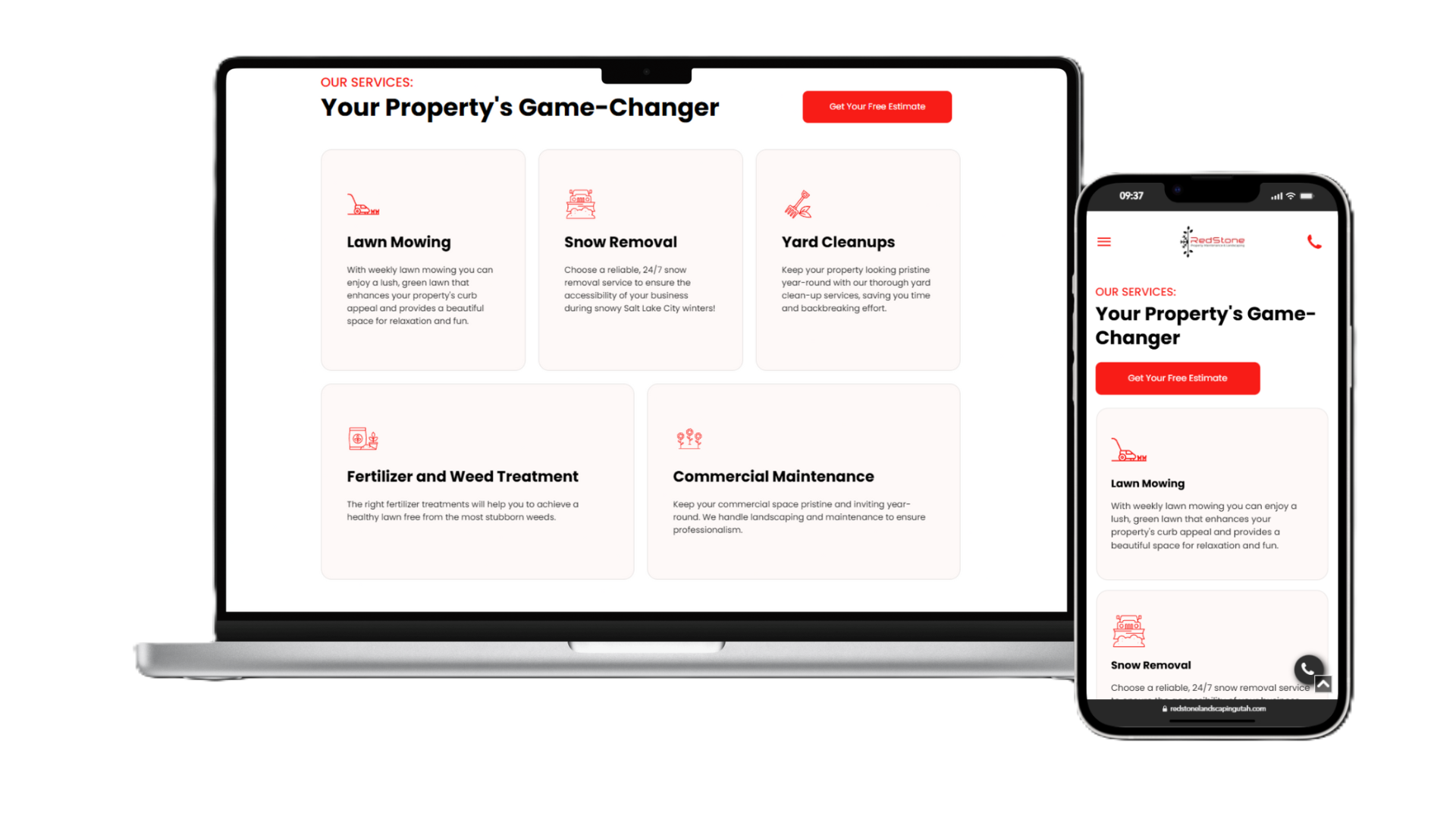
"Since partnering with The Lyon Brand we've seen an increased of
220% with our reviews and exponential amount of leads"
Zac Payne
Founder,
Redstone Landscaping
"Working with The Lyon Brand boosted our potential by a lot, So specifically we were able to do
$49k revenue in a single month and we were not doing that before The Lyon Brand."
Shaggy Eells
Co-founder,
Salt Lake City Christmas Lights
"I was lucky enough to meet Cole and The Lyon Brand, he was a
huge help and I cannot thank Cole and The Lyon Brand enough for getting my business up and running by having presence online."
Carrie Kirtley
Founder, SheCounts LLC
Fit matters
We're not for everyone and that's the point.
A great website requires participation. Not busywork, just the inputs that make it real.
This Is For
Operators who want a website that produces calls, not compliments
Businesses that want structure that supports local SEO long-term
Owners who can provide proof (photos, reviews, examples, service list) and respond during build
This Is Not For
Anyone who wants a template site and a quick handoff
Businesses expecting the site alone to “fix marketing” without offers, reviews, and follow-through
People shopping purely on cheapest price
Websites that look good but aren't built for SEO
Nice design, but no real site hierarchy, weak service structure, and nothing that helps Google understand what you do or where you work.
Google Business Profiles with reviews but no visibility
Plenty of reviews, yet the profile barely shows up because the foundation was never set correctly.
Content that gets traffic but no calls
Blog posts and pages targeting cities you don't serve or keywords that will never convert into real jobs.
Thousands spent on "cheap SEO" that does nothing
Monthly deliverables with no prioritization, no strategy, and no measurable impact.
Thousands spent on "cheap SEO" that does nothing
Monthly deliverables with no prioritization, no strategy, and no measurable impact.
next step
Want A Site That Actually Converts
On the call, we’ll review your current site (or lack of one), map the pages you need, and tell you the cleanest path forward—upfront ownership or lower upfront burden.
A clear page plan tailored to your services and market
The right structure to support local SEO and future growth
A recommendation on which payment model fits your stage and cash flow
Honest feedback on whether you're ready for a new site or if something else needs to happen first
If your site and GBP aren't structurally sound yet, we'll help you set it up correctly—so future SEO spend actually works.
Either way, you'll leave with clarity.